It is important to consider what Elements and features you will be using for your event in order to design the correct assets. Before discussing the App with your designer, it is recommended you know which assets you require based on the list below.
All Apps
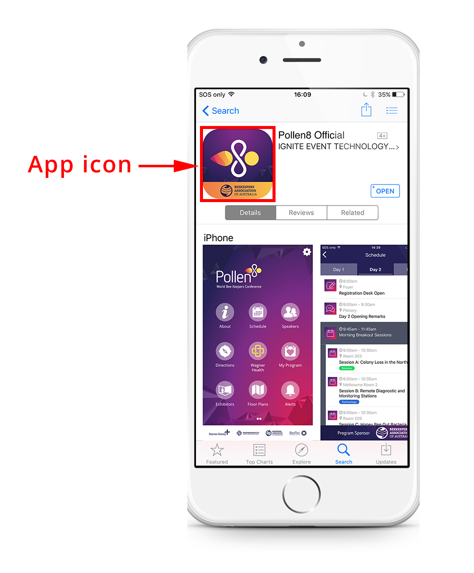
Core project icon
The icon used to differentiate one project from another in the Core. It is also displayed when using the Lead Capture or Interactive Sessions Elements.
Phone menu background
The phone menu background is an image that will appear under your menu icons and phone menu header (if transparent). It is best to keep this background somewhat plain so the text of the menu icons can be read.

Phone menu header
The phone menu header will sit on top of the phone menu background. If transparent, this will be placed over the top to blend into the background image.
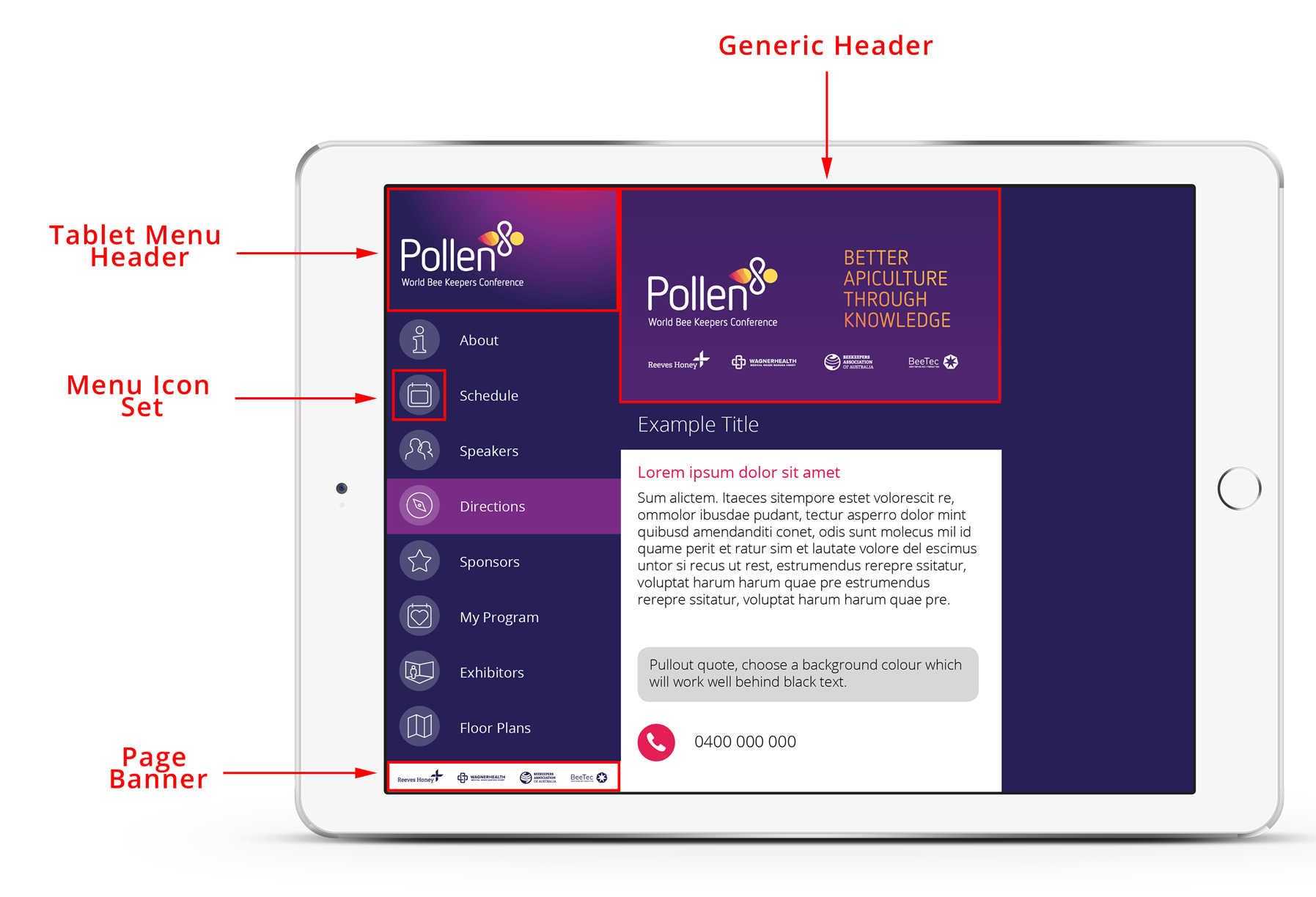
Tablet menu header
The tablet menu header will sit on top of the menu icon list on a tablet.
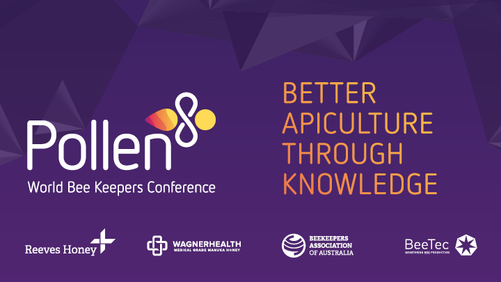
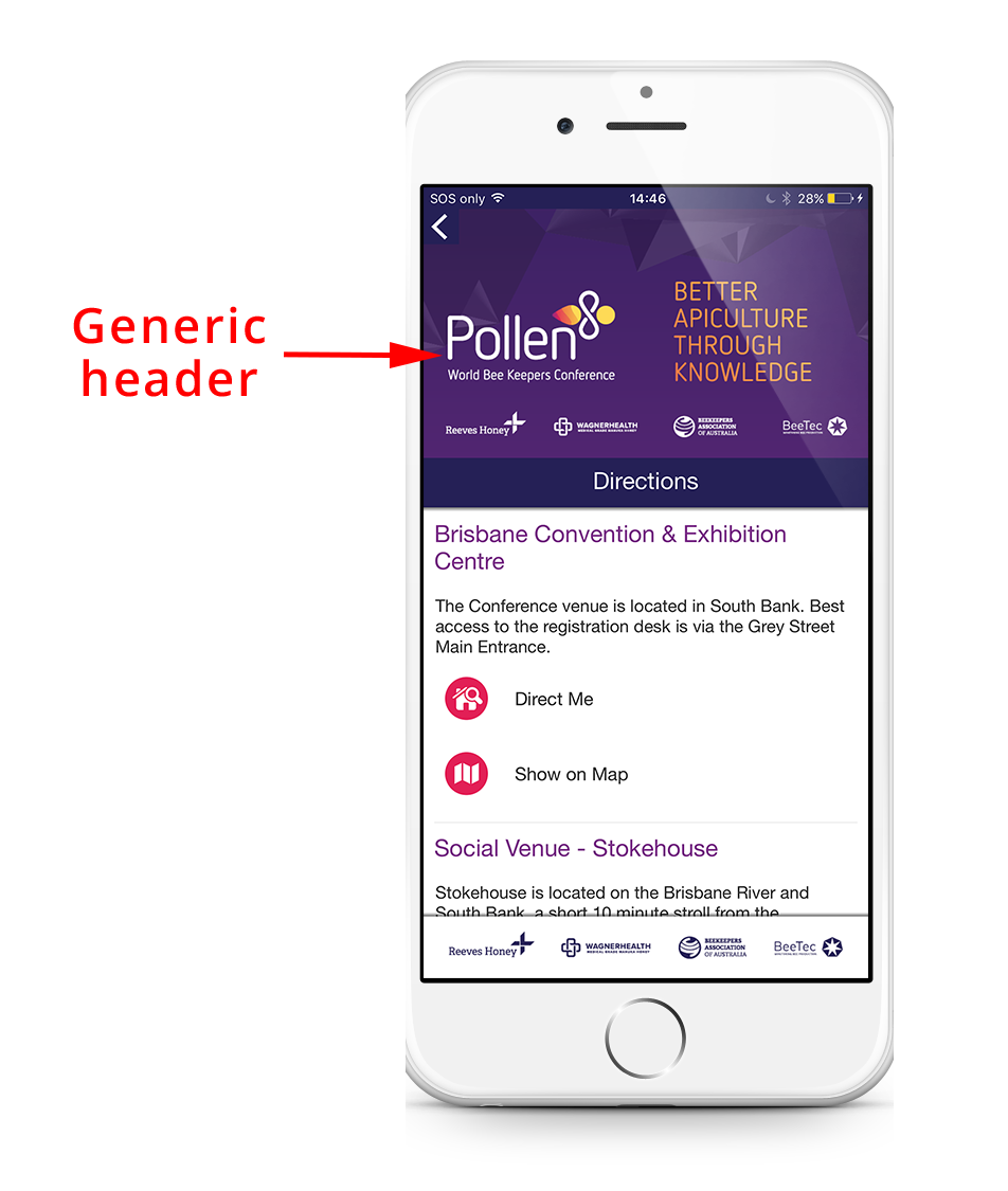
Generic header
The generic header will appear on every supporting content and features page. These can be overridden per individual page, however, the App will default to displaying the generic header.
Menu icon set
Custom menu icons can be uploaded to further enhance your App design. Note: The Core already contains 4 different sets of icons that can be used, so icons are not required.
Page banner
Page banners can be created to appear at the bottom of the app. Banners can be used to draw an attendees attention to something in the App (e.g. feedback form or special event) or be used as a sponsorship opportunity.

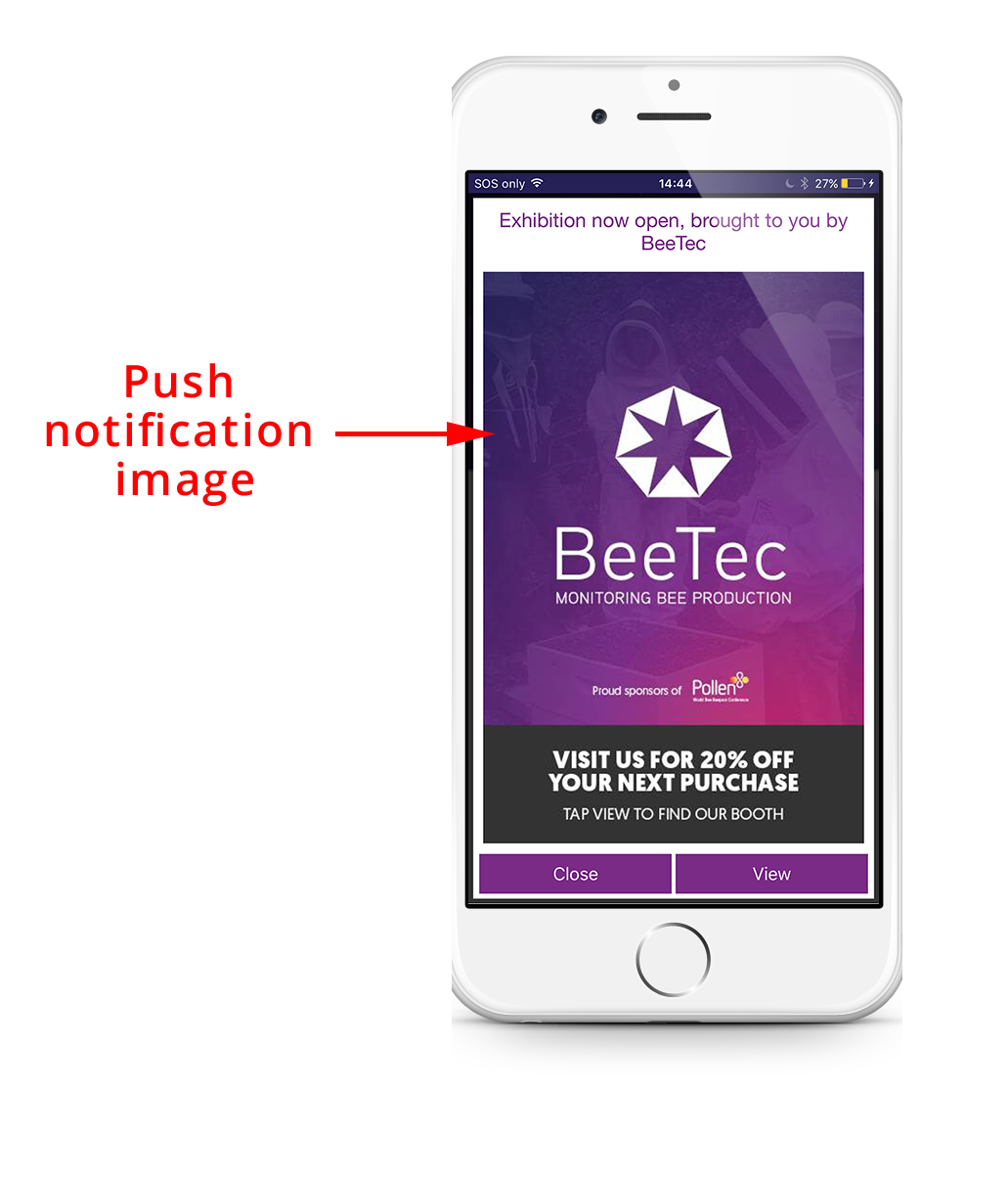
Push notification image
Push notifications are used to communicate important information to attendees. They can be used to keep attendees up to date with schedule changes, reminders, or to highlight any App sponsors etc.

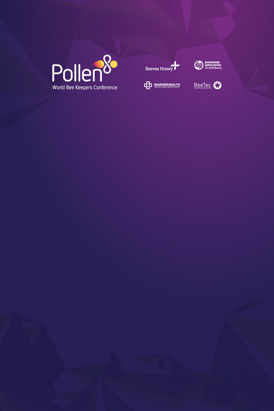
Example of phone App design requirements
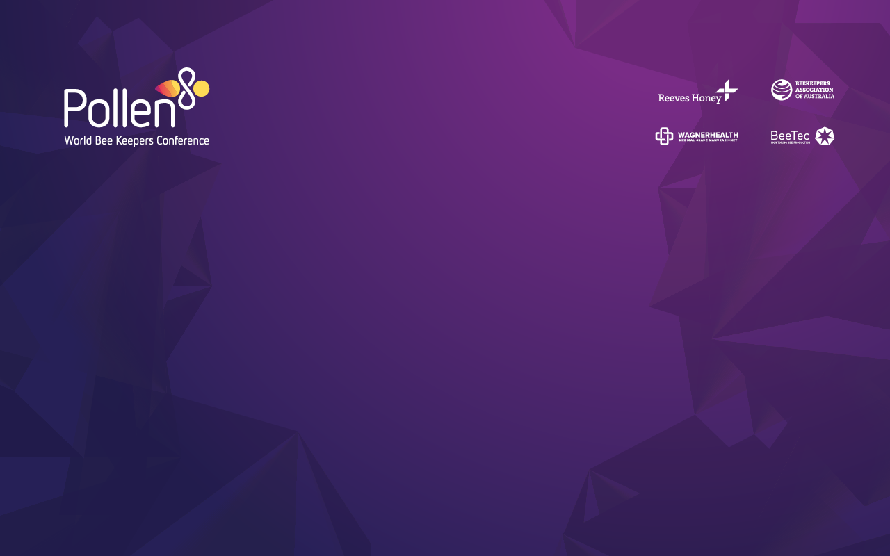
Example of tablet App design requirements
Example of App feature design requirements
Standalone Apps Only
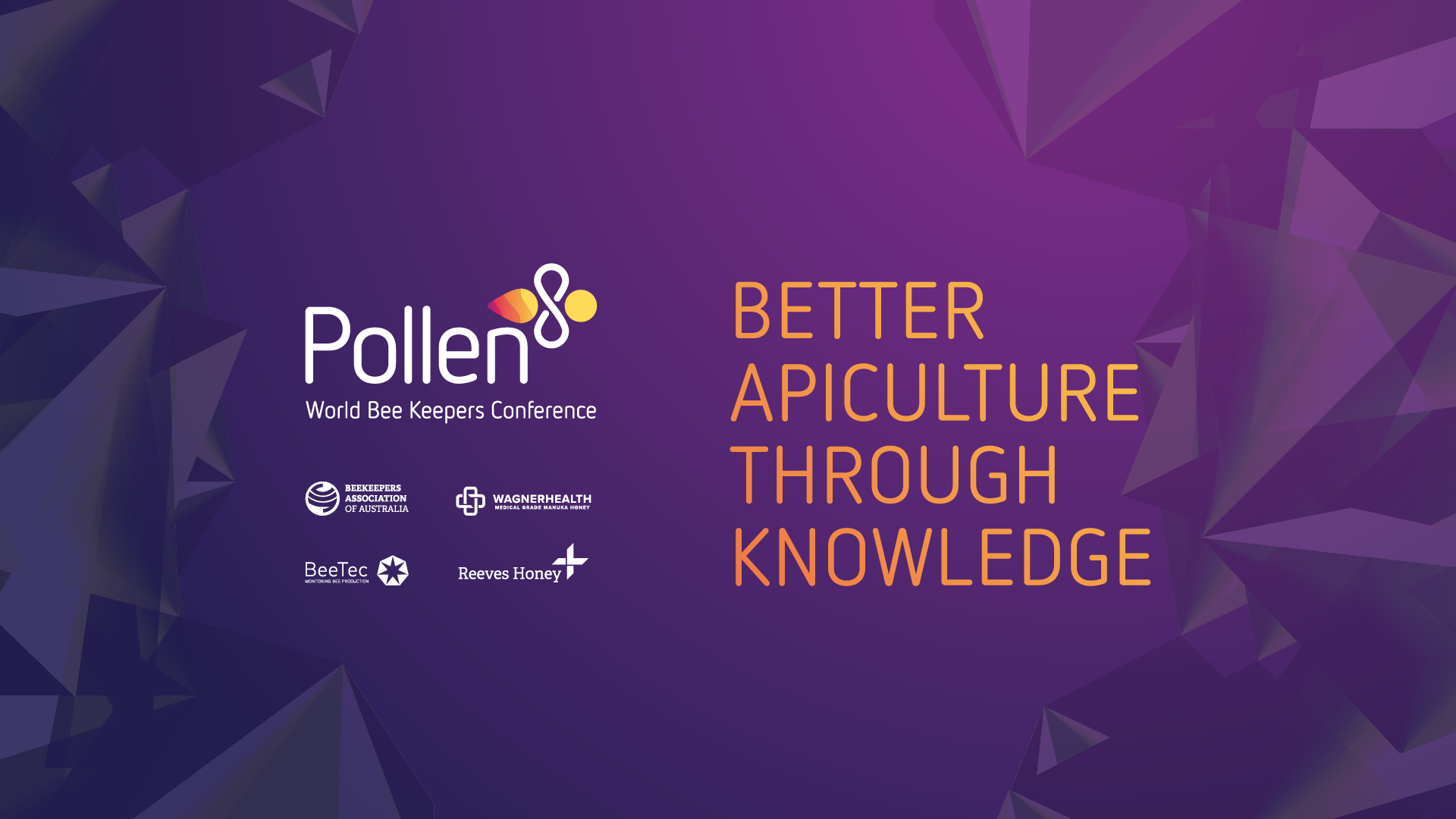
Phone splash/loading screen
A full-screen graphic that appears briefly as the App loads when it is first opened.
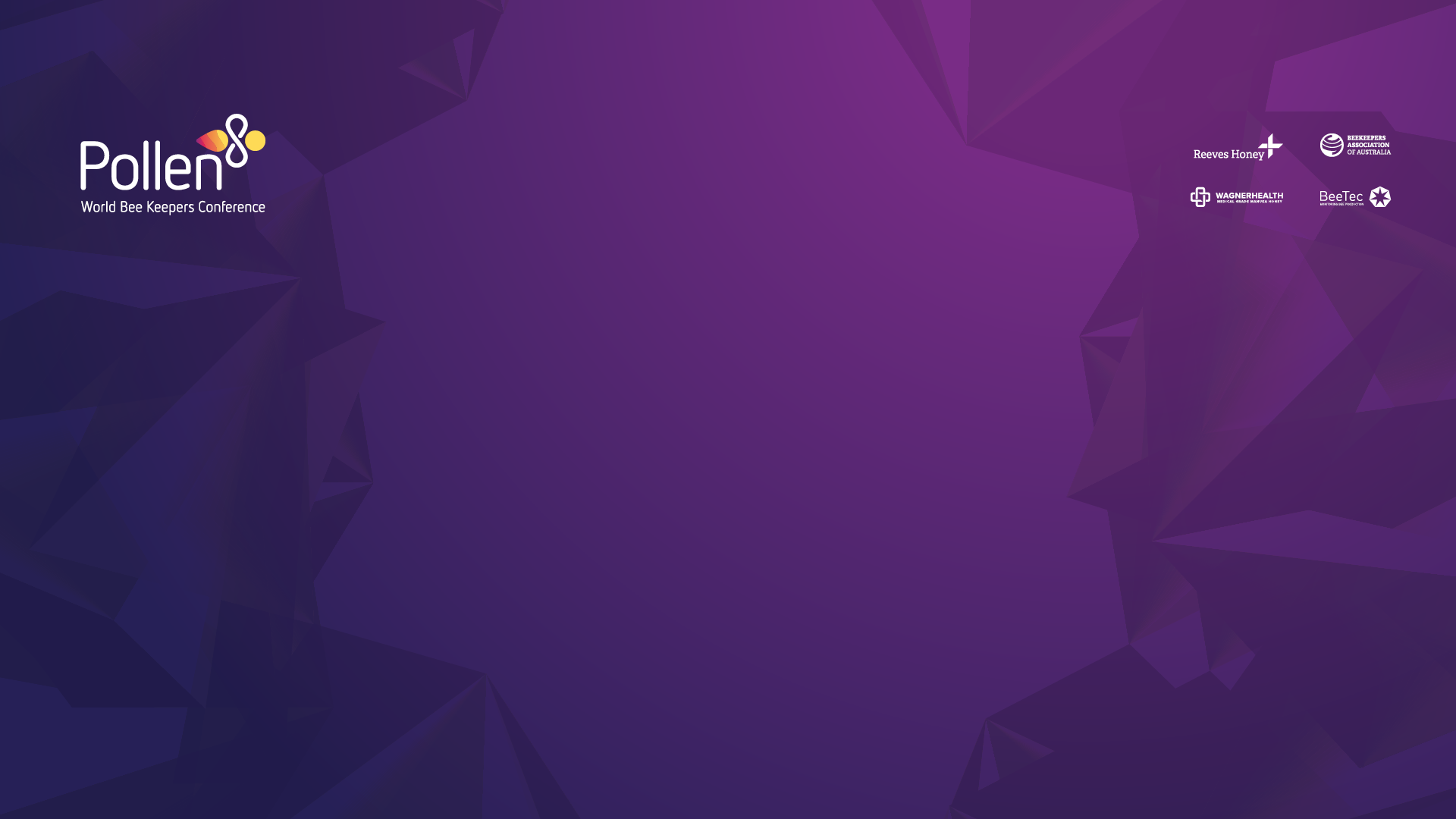
Tablet splash/loading screen
A full-screen graphic that appears briefly as the App loads when it is first opened.
iOS App icon
The icon that will appear when the App is downloaded on an iOS device.
Android App icon
The icon that will appear when the App is downloaded on an Android device.
Google Play Store feature image
The feature header image used as part of your App listing on the Google Play Store.
Example of App store listing
Interactive Sessions Element
Display screen background / Holding image
A holding screen used between asking live polling questions or displaying a question/comment. This is essential if you are running Interactive Sessions.
Registration Element
Registration header graphic
A header image for the registration form. Use this space to introduce the event, event date etc.

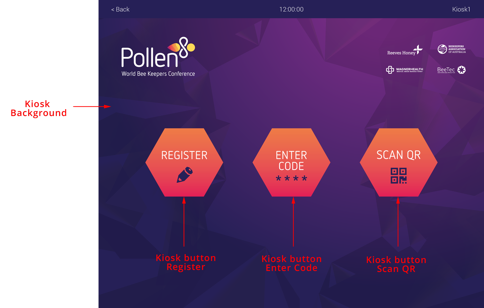
Kiosk Manager Element
Kiosk background: 5:4
The background image for a Sprintr kiosk.
Kiosk background: 16:9
The background image for other widescreen devices.
Kiosk background: Portrait
The background image or a Sprintr Mini, Portrait.
Kiosk background: 16:10
The background image for other widescreen devices.
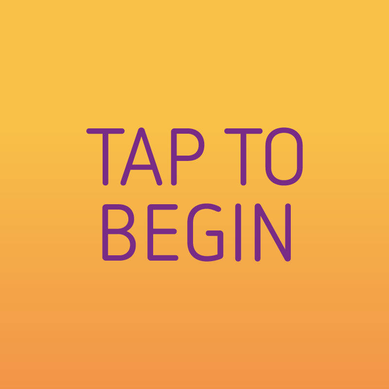
Kiosk button: Tap to start
Kiosk button on the main screen before clicking to display the 3 options.
Kiosk button: Register
A check-in option to register through the kiosk.

Kiosk button: Enter Code
A check-in option to enter Attendee Code to print badge.

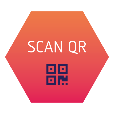
Kiosk button: Scan QR
A check-in option to scan an Attendee QR Code to print badge.
Example of Kiosk home screen

Example of Kiosk button options